DER SPIEGEL
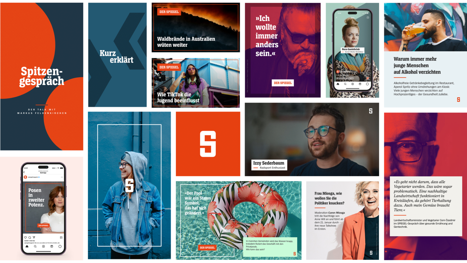
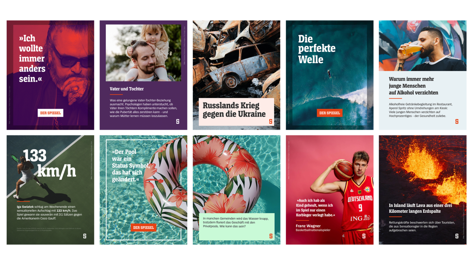
The new visual concept for DER SPIEGEL uses the iconic elements of the brand, reimagined from the ground up and brought into the modern era.
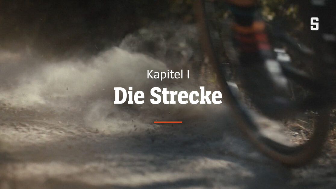
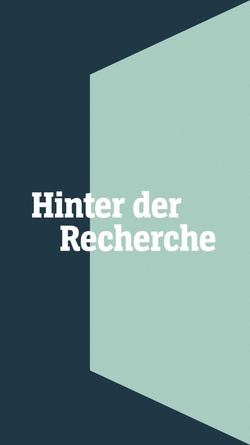
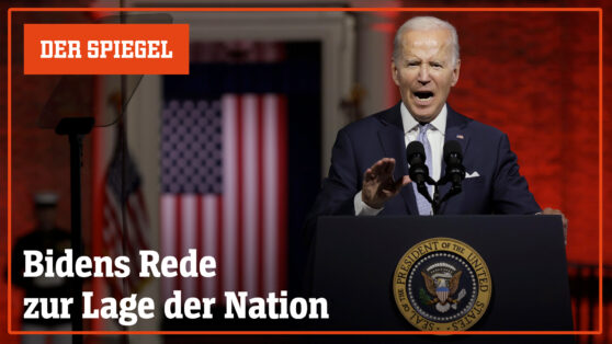
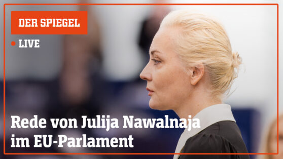
Alongside the established design ingredients, the frame—reminiscent of the print magazine covers—plays a crucial role in the visual identity. It serves as a unifying element across all platforms, helping to convey the brand. We expanded the color palette to cover a wide range of themes and established structures to make the content look more organized and well thought. Additionally, the color SPIEGEL red has always been an element and a color that could push the brand’s identity to the forefront. Therefore, our approach was to always include at least one element in this color, whether through our stroke or the S-Icon. As a result, we created a consistent visual identity across all platforms and provided elements such as lower thirds, infographics, split screens, openings, etc.
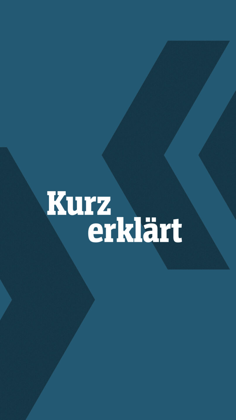
All ongoing formats were redesigned and reimagined. Through the new geometric design language, we created a system that can be applied to future formats without losing the branding character and consistency.
We provided tools on all platforms to make the design vision as simple and effective as possible for every user.
Design + Animation by Stefan & Denise Pumberger, Florian Hausberger
Project Lead by Jonathan Miske, Philipp Dreyer
Marketing, Management & Operations by Christine Ortin
Client: SPIEGEL
